
This publication aims to help fulfil the mission of “Applications In Life” Fondation to support and develop accessible and understandable financial education by improving financial culture and forward-thinking mentality of the civil society.
The trading system is a set of rules that guide us when to find and when to close positions. These rules or instructions are based on technical analysis and are validated and proven to be correct, based on old data. The trading system allows us to free ourselves from the emotions that invariably accompany the trading processes. When a trader sets out to find a position, doubts and questions always arise that strain him mentally. For example:
“Do I miss something in my analysis?” “Is the direction of the deal (buy or sell) the right one,” “Is it now the right time to enter, or is it better to wait, do I rush,” etc.
All these concerns in the trader interfere with or impair his trade. Possible mistakes are a hasty entry or late entry into a position, or omission of a profitable trade. If the trader does not have a trading system, he cannot be sure that tomorrow’s deal will be as successful as today’s one, much less a week, a month or a year. Each time he adjusts to find a position, he must take into account the current situation, with different techniques, indicators, rules, etc.
For starters, when setting up a trading system, it is necessary to determine what time intervals will work. Large restrictions on the determination of working time intervals necessitate the initial deposit and the principles of capital management. Longer time intervals are characterized by less noise than shorter ones. When using longer time intervals, the technical analysis is more accurate and produces less false signals. They are more preferred for successful work, but require a longer stop, which means. that a smaller amount of capital must be traded or a larger deposit is needed. When using smaller time intervals, there is more noise and technical analysis is more inaccurate and gives more false signals. Then we can use closer stops, but the likelihood of errors can increase. All these issues must be considered and carefully considered.
Capital management is a very important point in building any trading system. There are two main questions to be answered. The first is: How much of the total equity will be involved in each subsequent transaction? Recommended values may be 1/10 or 1/5 of the capital, but this depends on the individuality of the trader and the specifics of the trading system. The second important question is: What risk will it take and what kind of stopovers will be put? It is recommended that the risk not exceed 3 – 5% of the capital in each individual transaction. It is a mistake to think that when the stops are placed a short distance the risk is low. Close stops are more likely to be reached by price movements and lead to unnecessary losses. The size of the stops must be determined by the volatility of the market and the time frame on which it will be traded, and then the amount of the invested part of the capital is determined. Once determined, the stops and the amount invested must not be altered.
The main task of the trading system is to determine the market entry and exit signals. A certain set of circumstances based on indicators, graphical methods, or other, are perceived as an entry signal. The exit technique is either based on profit maximization or the so-called “trailing stop”. There are various trading systems. They are mainly divided into trend-tracking and trading systems that are suitable for the range, as different market conditions require different trading principles. Usually, trend-tracking systems signal the start of a new movement, which is expected to continue for a long time, relying on larger profits. Ranging systems rely on the entry of the best possible price and quick exit from the market. Most trading systems used by traders are trending.
Whatever trading system is chosen, it must be verified through personal observations of the market in which we intend to apply it. Building a good trading system is a process of continuous observation and research. However, the incentive is high. The winning system gives the trader confidence and confidence that in the long run the results will be positive and will provide accumulation of profit and wealth. Profitable traders know very well that success is not achieved through a single transaction, but by regularly extracting profits from the market.
We will present some trading systems and strategies used by successful financial market traders.
Linda B. Raschke
The pattern of Three movements according to the method Linda Raschke: strategy analysis
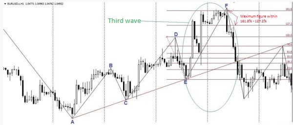
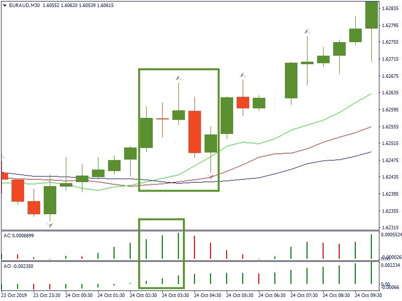
According to the method Linda Raschke, the pattern of Three movements is a harmonious pattern that are popular with traders in the Forex market very popular. Other graphic shapes Forex and the pattern of Three movements, is a model with a predictable development.
Three movements: detection methods
The candlesticks in Forex and their use as indicators of technical analysis are certainly the most discussed topic among traders and we can not say that all traders equally appreciate the analytical tools. The main theme of all discussions is the efficiency and accuracy of this figure in the Forex market. Candle patterns Forex in this respect is more specific, but their detection is often difficult.
The main condition for the effective use of graphic patterns is a correct choice of time interval. It should be noted that these indicators (most of them) should be used on medium-term (H4, D) and long-term charts. On short time frames these indicators generate too many false signals.
The figure shows the wave process. The undulating movement of the price is natural to all, without exception, trading instruments of the Forex market. The following criteria is to determine the pattern of Three movements:
- Price highs of the waves must be separated from each other on 0,618 is 0.78.;
- The distance between the adjacent lows of price waves (1;2, 2;3) is 1.27 or the 1.618 of Fibonacci;
- If the second and third cut patterns of equal length – it is safe to say that this is a classical pattern of Three movements.
Trade on the “Three movements”
Some authors strongly recommend to start the planning of the transaction after the completion of the first wave. But as practice shows, the first wave is very often short-term adjustments and at the end of the market continues to move according to the old trend. Speak confidently about the end of a trend and the turn of the market is possible only when the above conditions.
Perhaps the trader will be useful for a simple trading strategy, developed on the basis of the pattern of “Three movements”.
The algorithm of this trading system bullish trend includes the following steps:
- Installation order Bay Stop. For cautious traders are recommended to place the order at the level of 1,618. For the more adventurous suitable level of 1.27;
- Stop loss below the 1.618. actually rigid boundaries do not exist here. It all depends on the ambitions of the trader and his risk appetite;
- In the classic version of this system profit is recommended in three stages on the levels of 0.618, 1,27,1,618.
Like any, countertrend trading system, this strategy promises trader big profit and at the same time, the use of such methods is associated with a high degree of risk. It is natural, because in the process of turning the trend for the market is characterized by high volatility, the result of which is the generation of a large number of false signals. In such a difficult situation in the first place come the ability of a trader to properly manage assets and accurately to control their own emotions.
Advantages and disadvantages of a pattern “Three traffic”
Evaluating the pros and cons of the pattern, I should say that the Three movements is a typical reversal indicator with all the good and bad qualities inherent in this group of indicators graphical analysis. When properly installed and configured it is able to quickly and with a high degree of accuracy to assess the prevailing market trends and to warn about the desire of the market to change the trend. At the same time, as with all trend indicators, the Three movements are not able to determine the full potential of the market.
Three Indians: an effective indicator and trading strategy
Three Indian pattern is a counter-trend figure, representing the culmination of a model losing a potential trend. This wording clearly does not add to the pattern’s popularity, because every self-respecting trader in advance opposed to any of the trading strategies against the trend. This commandment is not negotiable, but at the same time I would like to note that trade against the trend, when correct analysis of the market and sophisticated money management that promises the trader a more substantial profit than trading with the trend when it comes to March in ranks and not in the forefront.
In light of the above we can confidently say that the Three Indians indicator, which can be downloaded in free access, deserves the attention of traders at least for the memories.
Three Indian languages: methods of detection
In appearance the figure of Three Indians, or as they called her Linda Raschke – Three little Indians, very similar to the classic ABCD. The main difference between these figures is that ABCD is formed by two waves, and the Indians three. If we consider these patterns as a mathematical model, we can say that Indians are additionally filtered ABCD.
In specialized publications and articles often can be found the description of the detection algorithm figure Three Indians almost from the first moments of its existence. We need to wait for forming the first wave, stretch the chain Fibonacci and quietly wait for the second wave. This option is well suited to “historians”, because in real time it is impossible to identify with certainty the first pulse. Before the advent of chart formed the second wave can not reliably determine is a burgeoning Three Indian or a random jump in prices or a correction.
And only after the chart displays the first two Indian possible to predict the emergence of another, i.e. to calculate the parameters of the third wave and, accordingly, to set a pending order.
For these purposes, Fibonacci levels – you need to stretch the mesh from points D to E.
It’s a bear version of the figure that received the gloomy title “Three black crows”. Forex sometimes shows the bullish version of “Three white soldiers”.
Features Three crows pattern on Forex
Given the picture the example of the figure “Three ravens” in that the precise execution found in reality is very rare. Because the figure is counter-trend and everyone knows how unpredictable the price of turning the trend. Therefore, to recognize the Indians always quite difficult. There is a direct correlation definition of this shape from the duration of the time interval. The larger the time frame is chosen, the clearer it will be drawn by the Indians. To apply the pattern for day trading is not recommended for reasons stated above.
There is a version of the Indians for intraday trading – it’s called “identical Three crows”.
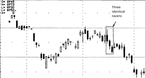
The main difference of this pattern is a clear inheritance of candles, ie the opening price of next candle is equal to the closing price of the previous one. Very rare figure on the Forex market is “The same crow”. All the Three Indians are harbingers of a trend reversal, which is necessarily accompanied by high volatility and frequent Gaps.
Strategy Three Indians includes a number of signals that enhance the figure. For example, if the first black candle (body) will be located below the maximum level of the last white candlestick, it is a good sign for sellers that informs about the seriousness of the “bear claims” and the great potential of the emerging trend. Accordingly, a favorable picture for the buyers will look exactly the opposite.
Lewis Borsellino
“Every position has to have what I call preparation, aiming and fire. That’s what needs to be worked out, the money comes as a result.”
Whether you are trading with a trading system or through your own analysis, you should strive to separate your deal in three steps – preparation, aiming and fire.
Preparation: This is the first step in our preparation for trading. It involves freeing us from non-trade thoughts. Study and analyze graphs. Determining what your orientation will be throughout the day, at what price you will buy / sell, based on support or resistance levels.
Targeting: At this stage we are monitoring the market, trying to see the scenarios identified in the first stage. For example, if we found a very strong level of support in a given market. The market opens above this level, briefly goes up, and then begins to move down. As we approach our key level of support, we are preparing to buy.
Fire: This is the moment when everything is combined into one. We have identified a price level and are aiming for the expected scenario. We are now “firing”, executing the transaction at an already identified price. We set stop and start price.
Following these three steps, we are developing what might be called a trading plan. According to Borselino, there should always be a plan, to trade our plan, to know the point of entry, the stop and when to leave the market.
Most important in Luis Borsellino’s work is his distance / energy analysis. During his many years of experience in the markets, Borselino has noticed dependencies between the indicators and charts of the market instrument.
We’ll look at the patterns he found between the market chart and Moving Averages (MA).
What he noticed was that, depending on the distance between the chart and an MA, the market has a different amount of energy. Toes, depending on the distance, can be talked about overbought / oversold, reversible, or at a level where the market will meet support or resistance. In his analyzes, Luis Borsellino used primarily 200, 50, 20-period MAs, mainly for the S & P500 and NASDAQ. For example, the author noted that a reversal could be expected with NASDAQ if the index traded at more than 12% of the 20-year MA.
Practical application. Regardless of what phase of the trend we are in, we can apply this tactic as follows. If we witness a strong rise that crosses the 6% limit between the current price and the 200-year MA, we already know that the market at these levels is becoming overbought. That alone cannot be a signal for sale, we have to wait for a specific signal from the other elements not our analysis.
One possible option for these ratios is: we notice that after crossing this barrier of 6%, a reversing price figure is formed, accompanied by divergence in the indicators. This figure would then have greater validity than if it were formed at a distance of less than 6% from the mean.
On the contrary – a figure with a dual character formed before this 6%, for example between 3% and 4% – then it is more likely that this figure will be lasting.
It is possible to use several averages at one time, most often three, to show the three types of trend. For example, to use the average 200, 50, 20. The three indicate where the trend direction is in different order.
A historical check shows us what the ratios are for these dimensions:
MA 200 – 6%
MA 50 – 3%, 3.5%
MA 20 – 2%
For this example, we will only use the values to reverse the market direction.
Let’s say we see the following picture: the price movement makes a correction at levels 5% away from 200 MA. The market resumes movement after this adjustment and crosses the 6% limit. Now we have to wait for the others
two ranges to be reached, followed by a correction or reversing of movement again.
If we also examine the data on what range of adjustments will end and the market will resume its movement, we will have an idea of a possible development of a given movement. In other words, we will draw the boundaries of this movement.
The use of distances between the graph and the average is suitable for combining with almost any trading tactics or trading styles.
The main thing to note is that these values cannot be fixed accurately. It cannot be said that if the market corrects up to 300 pips from an MA, it will follow a resumption of movement. Therefore, we are talking about an area where support or resistance can be expected. The second major point is that these areas are different for different instruments, for different markets. Before using such a technique, it is necessary to carefully examine the instrument we are trading (currency, stocks, commodities) to determine which averages behave best and what is the ratio.
Joe Dinapoli
Introduction
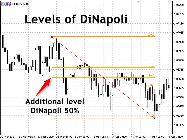
New trading strategies and modifications of classical trading systems appear every day. One of the most famous methods was created by Joe DiNapoli, trader, economist and author of popular books. His widely used system is based on Fibonacci levels.
In this article, we will have a close look at the system. I have made my best to explain the basic concepts and trading principles that otherwise cannot be described without close acquaintance with Fibo levels. So, what are these levels? How to interpret and apply them in practice? And most importantly, how do they work in trading?
DiNapoli levels: the basics
To define market entry points you have to apply the general principles of trading DiNapoli levels, including how to correctly plot them on charts and interpret their readings relative to the price movement.
DiNapoli strategy is based on Fibo levels. Only the horizontal markup is used in this method. Fibo arcs and fans are not applied.
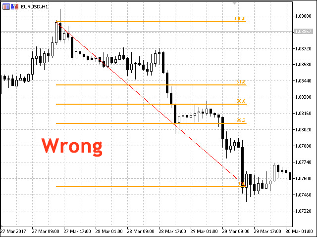
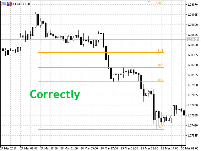
DiNapoli levels are basecally support and resistance levels, although their interpretation is more deep as compared to conventional levels. They are based on Fibo levels and apply the market swing or, more simply, a trend. To build DiNapoli levels we need only three Fibo ones: 61.8%, 50% and 38.2%. These are the levels to be used on your chart as support and resistance ones. The Fibo levels are plotted upwards in case of an uptrend and downwards in case of a downtrend.
Ideally, the lines are arranged from 0% to 100% in the direction of the current trend. All Fibo levels exceeding 100% are used to set position closing points.
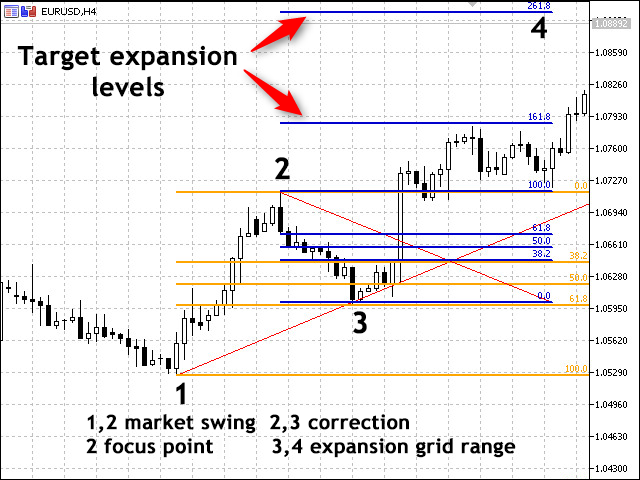
DiNapoli levels can be applied in two ways — as an extension and correction.
Correction is applied for detecting target entry points, while an extension grid is built for detecting market exit points.
Main principles and concepts
Fibo node is the price chart point, at which correction movement ends. Joe DiNapoli advised to work only with nodes found between 38.2% and 61.8%. All nodes located below 38.2% are too insignificant, while the ones exceeding 61.8% are too strong (meaning a trend may not recover).
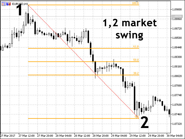
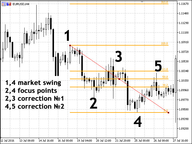
Market swing (distance between extremums) — distance from the beginning to the end of the price movement, the Fibo levels are plotted on. If the price changes its High or Low point after the end of the correction, you should also move the extreme point of the levels. In this case, the swing increases.
Accumulation is the place on a chart where an accumulation of several Fibo nodes (multiple correction levels close to each other) is detected.
Focus point (extremum) is the extreme point of the market swing (level the price correction starts from). When an extremum changes, another focus point appears on a chart. Thus, there may be multiple points on the chart in one swing zone.
Target level is the point on a price chart where you want to place a take profit.
Target point is the any chart point an action is planned at (market entry, market exit, etc.).
Reaction is the finished correction in a trend movement. In a single swing radius, several reactions may form.
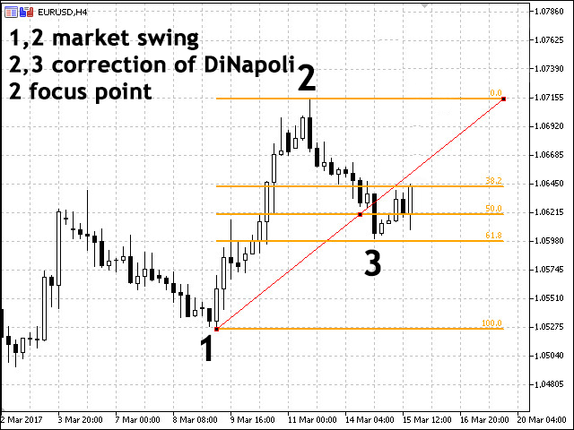
Each time market swings should be corrected relative to the chart, because a price chart is constantly moving. In this case, the swings are expanded each time leading to changes in the number of focus points on the chart. Price corrections called “reactions” appear in the center of the market swings. Each of them has its own index.
Tips from DiNapoli
Signals received from the levels produce results only if correction levels as well as accumulations/support levels are located within the levels range of 38.2%-61.8%. Other signals are ignored.
Use common Fibo levels reaching the last correction as take profit levels in order to place a stop loss on 161.8% and 261.8%.
The number of swings on the chart is always equal to the amount of focus numbers.
Focus numbers are always located to the right of the reactions they are connected with. In other words, price corrections formed on the levels swings should be located to the left of the focus number.
The higher the timeframe, the lesser the number of reactions. As you may have already noticed, when working on different timeframes, the price movement is quite fast on small time periods, whereas these movements are not even displayed on higher ones.This rule is also used in the reverse order: when the price detects a strong resistance/support, you are able to find necessary reactions and swings that are not displayed on higher timeframes by using lower ones.
Fibo/DiNapoli extensions
DiNapoli extensions grid can help us to define market exit points based on Fibo extensions grid. This time, we will use the levels of 100%, 161.8% and 261.8% that are target points for setting a take profit.
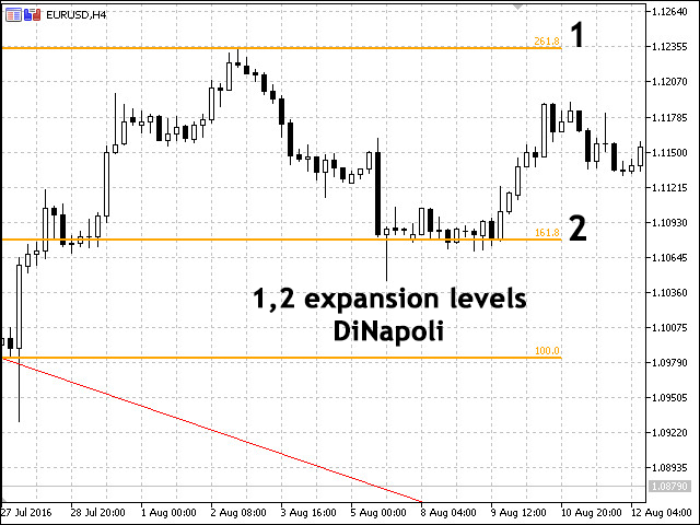
The Fibo extensions grid is built the following way:
For a downtrend — starting with a Low price to the price correction peak formed by the price roll-back line beginning from 38.2% and higher.
For an uptrend — starting with a Low price to the price correction minimum crossing the level of 38.2% and higher.
DiNapoli levels trading technics
We can develop several trading tactics with “aggressive” and “quiet” levels.
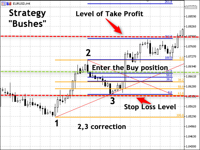
The aggressive one features two market entry methods: Bonsai strategies and the Bushes. The trading principle is similar, the only difference is the stop losses.
The quiet strategy also describes the two methods: Minesweeper A and B.
When applying the aggressive trading method, it is assumed that the price rolls back from the level of 38.2% and the already formed swing. The only difference between the Bushes and Bonsai strategies is the Fibo level, after which a stop loss is set.
Let’s start from the Bushes trading method. According to this method, positions should be opened the moment the price on the generated corrections grid crosses the level of 38.2% in the current trend direction, while a stop loss is placed further than the level of 50%. According to the Bonsai method, the market entry is similar to the Bushes one, although a stop loss is set stop short of the Fibo level of 50%.
Following these methods is assumed to be aggressive since there is a risk that the price roll-back on the chart may not happen. It is quite common for the price may enter flat just for a short while, or the correction to turn into a new trend. Therefore, if you decide to apply this method, wait for a full confirmation of the signal to be on the safe side.
DiNapoli emphasizes that a considerable slippage is probable when executing a stop order in that case, since there is no powerful level meaning insufficient number of trades and no solid request matching. Thus, the choice depends on a brokerage company and a trading platform. Such situation is unlikely, if you trade highly liquid instruments with a small volume in the market.
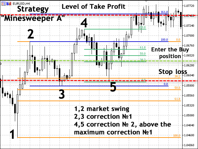
Minesweeper A and Minesweeper B strategies
The most quiet and less risky strategies are Minesweeper A and B. According to them, a market entry should be performed after a correction, while the trading itself is conducted using safety measures.
Minesweeper A. First, we wait for the initial correction to finish (no market entry), then for the second correction to form. Only after that, we open positions. A stop loss is placed the same way as in the previous strategy, i.e. behind the next Fibo level.
Minesweeper B. Instead of opening positions after the second formed correction, they are opened after the third, fourth or even later ones. In other words, we enter the market only after the trend is thoroughly confirmed meaning the risk of false signal is considerably reduced.
What are the results of the strategy? The market entries are infrequent. A trend is not always long-living enough to provide 3 or more correction moves in a row corresponding to the rules of this trading system (a roll-back end should be on the levels from 38.2% to 61.8%). On the other hand, this allows us to sort out false signals, in which the price correction does not become a continuation of a trend.
If you come across a rather long-living trend featuring multiple corrections (reactions) and follow all the analysis rules, your chart is quickly littered with many unimportant levels and lines. Most of them can be simply discarded as redundant data that do not fall under the rules for trading DiNapoli levels.
Suppose that you see a powerful uptrend with a few reactions. At some time, you have a correction of all upward movements. As a result, the price starts re-writing the Lows of some reactions. Such reactions should be canceled and their Lows should be discarded.
DiNapoli levels indicator
For those unwilling to spend their time plotting DiNapoli levels manually by placing Fibo levels, there is an indicator doing that automatically. The indicator is attached below. It can also be found in the CodeBase. Let’s analyze its operation in more details. The indicator name has been changed for more convenience.
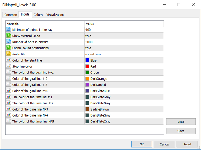
The indicator is installed in a usual way by placing the file to the Indicators folder of the MetaTrader 5 root directory. It does not have too much settings most of them being level colors. The colors are customizable, but I do not recommend changing them if you are a novice in order to avoid display and market analysis errors.
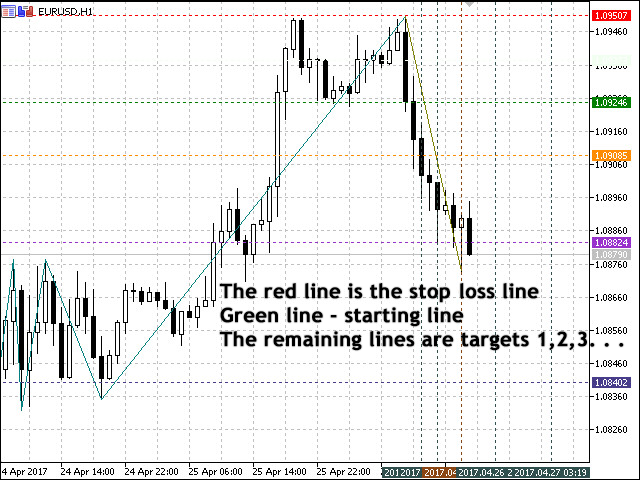
The indicator for auto display of DiNapoli levels also includes Zigzag with a ZigZag reversal audio signal. The red line marks the place for placing a stop loss on the chart, while the blue one shows the operation start level. The remaining horizontal lines are price target ones. The vertical time layout lines are shown by the indicator (they can be disabled in the indicator settings).
RAILS
Rails are a model that can be used on all timetables, from five minutes to a month. This is a signal for a higher-order trend direction. It represents a sharp rise in price, which is currently very low or very high, and then starts a massive buy or sell, returning the market back. By returning back to the level from which the sudden movement began, the model is completed, and the point from which the movement began and returned is called the recognition point.
The author presents this model with the following example:
“Imagine that houses on the oceanfront of Santa Barbara, California are suddenly being sold for $ 100,000. Hop !, and they are gone. within their previous limits. “
The rule for finding a position is either on a slight return to 0.382 of the length of the rails or as soon as the prices have passed the recognition point. The stop order is placed at 0.618 of the length of the rails. The objective is within the OP.
So far, we have looked at some of the strategies suggested by the author. Now let’s turn our attention to the main thing in Joe Dinapoli’s creative work, namely the trade with Dinopoli levels.
What are Dinapoli Levels: These are eligible levels of support or resistance. Basically, these levels are based on Fibonacci theory. With them, the author takes this theory to a new level. The levels of
Dinapoles include: Fibo Levels, Target Points, Accumulation, and Price Consensus Areas.
- Market Swing. The market swing is a defined move in the market, lasting from minutes to years, beginning at a significant minimum or maximum and ending at the last high or low, respectively. Market scope can be defined as a wave.
- Reaction Number. This is a low or high point within the boundaries of individual market waves moving in the same direction as the market swing. These points need not be exactly the minima or maxima of the waves they describe.
– Hidden levels of Dinapolis. In his book, Dinapoli defines reactions that remain invisible and that provide hidden levels to Dinapoli. They are obtained in the presence of a “gap” (price gap in the market) and the end of this “gap” is taken as a reaction point.
– Reactions starting with a strong impulse are more valid.
- Focus Number. It represents the end point of the market scope. This is where all the adjustments (Fibonacci) are calculated. When the focus number changes, the Fibo levels change as well.
- Fibnode. This is a level of support or resistance,
corresponding to a certain Fibonacci correction. Dinapoli uses only the following Fibonacci adjustments – 0.382 and 0.618. Marks them with F3 and F5.
- Target point. This is a number based on Fibonacci extensions showing targeted reasonable profit.
- Confluence, “K”. This is the point or price area where two Fibo levels of 0.382 and 0.618 from different reaction numbers are detected. This defines it as a strong level of support or resistance.
These two Fibo levels have approximately the same value, a small difference is acceptable. “Accumulation” includes in addition to the two Fibo levels and the area locked between them.
- Reasonable profit (Logical Profit Objective). This is a price target for finding positions obtained through “oscillator-predictor” and mainly through Fibonacci extensions.
- Agreement. Price area of coincidence or close enough distance between the Fibo level and one of the COP, OP, OR targets.
- Cost destruction. If the market breaks through any of our Fibo levels, then that level is no longer active and we can delete it from the chart.
The rails look like on the chart
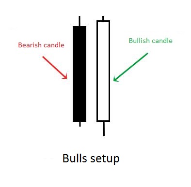
The pattern of rails, the Forex market consists of only two candlesticks and can testify as to the change of bullish trend to bearish and Vice versa. In any case, it has the following characteristics:
Two candles of different colors have large body and small shadows (often without shades).
The closing price of one candle is almost identical with the opening price of the other (if it differs within a few points is not critical).
In most cases, the size of the bodies of the candles are exactly the same – the graph shows that they are flush with each other, so they are called “rails Forex”.
In the case when an uptrend changes to downtrend, talking about the bearish setup. It looks like this:
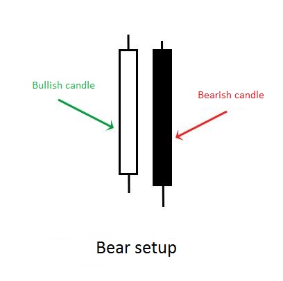
Bearish setup
If on the contrary the descending stops and is expected to start for the growth rates, the pattern of rails on the Forex looks mirror:
That increases the chances of winning
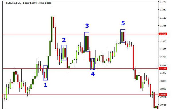
Figures Price list Action, including the pattern of the rails, are often used in combination with other signs that can confirm the signal:
- If the market has already formed a clear trend, and the rails were formed immediately after the correction is a reliable entry signal in accordance with the direction (on the chart these situations are shown in figures 1 and 4).
- The rails are formed near important support level (in the case of the expectation of rising prices) or resistance (in expectation of falling prices), which have repeatedly been checked. So, in the chart of the stronger signal 5 signal 3, as in the first case, the price has tested the level as resistance.
- If the bodies of the candles are large and formed almost on a par with each other, and shadows are very minor or absent.
- If the rails are formed on higher timeframes (from H4).
How to use a pattern of rails in real trading
Subject to all conditions to enter the market what is a pending order. This is to ensure that it does not get activated if the price goes in the opposite direction. Thus it is necessary to take into account the following conditions:
- the order is fixed above or below (depending on trend) of the second candle, when it is already formed;
- stop loss you need to put a few points above or below the opposite end of the second candle;
- take profit it is best to put on a strong level of support or resistance, which is closest.
Below you can see example of placement of stop loss in case of a buy entry:
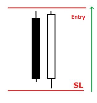
A buy entry
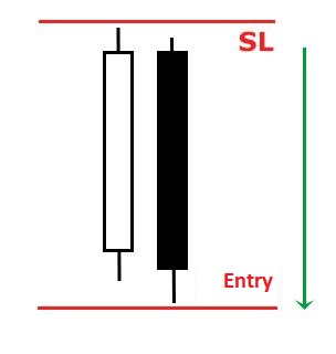
And this drawing illustrates the case for a sell entry:
When login is not necessary
Of course, none of the trading strategies do not work by itself, without considering other factors affecting the price movement. In the case of using the pattern of Rails should take into account those characteristics that weaken the effect of the signal:
If the shadows of the candles are too big, and the body, on the contrary is small, the market is in limbo and the future forecast is more difficult to do.
During the release of important economic news, as well as the first hours after the market they can choose the trend or seek to maintain the current of the previous trend, so the degree of uncertainty of future predictions increases.
If bearish pattern setup Rails formed on the back of strong bullish trend and Vice versa – such a signal is unreliable (see example 2).
If the pattern formed on the range market, which is still undecided with the current trend, such a signal is also better to ignore.
ELIUTE TRADE SYSTEM
The main figure in the ELIUTE system is the figure “E”. She is an extremely simple figure based on the ratio of the four main prices – the highest, lowest, opening and closing prices. The “E” figure is formed when, after the opening of the new bar, prices go above the previous high or low value, but fail to stay at the new levels and return back, closing below or respectively above the opening price.
The correct and incorrect interpretation of the figure “E” is shown here.
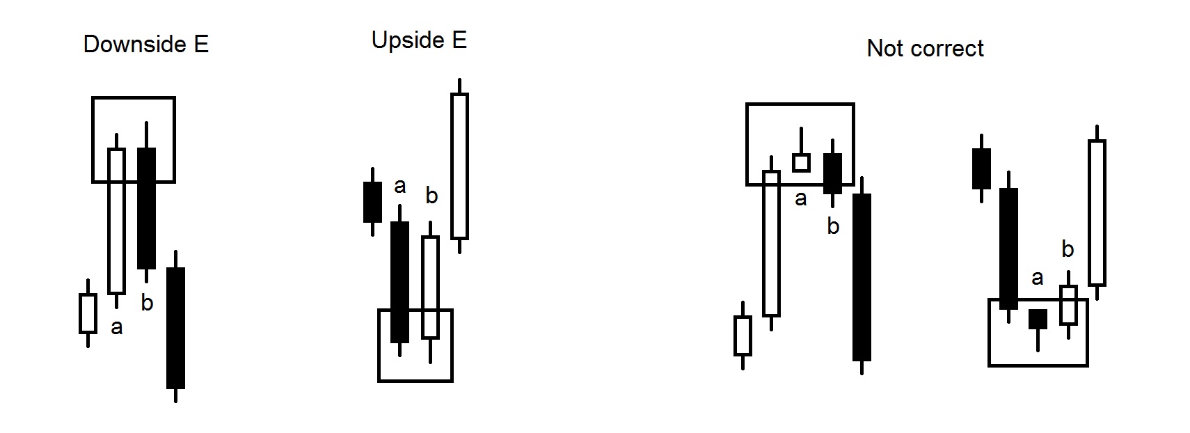
In the basic form of figure “E” the only important condition is
reaching the new highest or lowest value, after which the market closes, forming a reverse candle, if “a” is a scouring candle, “b” will be a sword and vice versa, “b” completes the figure. Exact price ratios, price gaps, or other items can serve as additional filters for this model.
Let us now look at the trading tactics based on this figure or the rules of the ELIUTE system.
Sign in. The rules for opening a position are very easy to use. They are as follows:
- Purchase – We buy if after the formation of an upward “E” the market manages to pass the highest value of the bar (candle) ending the figure, ie. this is “b”. In other words, we buy when the market exceeds the maximum of “b”. An additional condition is that, by the time of purchase, the distance between the lowest price of the current bar and the opening price should be less than the same difference with the previous bar (bar “b”).
This means that the lower shadow of the current bar is less than the good shadow of bar “b”.
- Sales – Similarly, we sell if, after forming an “E”, the market succeeds in passing the lowest value of the bar (candle) ending the figure, ie. this is “b”. In other words, we sell when the market passes the minimum of “b”. An additional condition is that, up to the time of sale, the distance between the highest price of the current bar and the opening price should be less than the same difference with the previous bar (bar “b”). This means that the upper shadow of the current bar is smaller than the upper shadow of bar “b”.
Add to position. There are two rules for adding:
- Add in the formation of a new signal in the same direction;
- The second rule is for faster addition in order to maximize the momentum gain. With it, additional contracts are bought or sold if the next bar passes the highest (buy) or lowest (sell) level of the bar at which we made the transaction.
The limiting condition here is the same as with the main signal – until the time of purchase / sale the distance between the lowest / highest price and the price of opening the current bar is less than the same difference with the previous bar.
Addition under the second rule can only be done until the third bar after the initial transaction. This addition is very effective because, when starting a new impulse, very often several consecutive bars in the same direction are initially noticed.
Stop. ELIUTE has two stop options. The first one is conservative, with the purchase stop being set at a level derived from the distance between the lowest and the opening price of the previous bar (bar “b”) added at the opening position. In other words, if the lower shadow of the current bar becomes larger than the lower shadow of bar “b”, we should close the position. The same is true for sales – if the distance between the highest price and the opening price of the current bar becomes greater than the same distance at the previous bar (bar “b”), we should close the sale.
The second stop option uses respectively the highest (sale) or lowest (purchase) level of bar “b”. In case it is passed – we close the position. This option implies a larger stop, so it is advisable to use it for the initial entry into the market, and the first option is more appropriate when adding to an already existing position.
Exit. The hardest part about a position is its exit. If we close too early, we will miss out on a lot of traffic if we wait, we risk the market changing direction. When to close the position so that we can simultaneously prevent ourselves from returning to the market but also maximize profits?
There is no exact answer to this question as far as ELIUTE is concerned. In order to be able to define when to leave the market, we need to consider how long the order will be before the market enters chaos again.
The first option in which we are obliged to close the position is when a new signal is reversed.
Many different methods can be used for the output. Such as:
- Larry Williams Catapult (“Catapulting” is the closing of the position at the first profitable opening after the entrance. In other words, after entering the position, we wait for the first opening price at which our result is positive and then close the position.
The “catapult” technique can also be applied to the opener
price after the position has been open for two or three days. In this case, the profits increase many times over. If the market goes against our position, Larry Williams recommends using a “dollar stop” – a stop in the form of a sum of money, not at a certain technical level.);
- close the position after we have made all allowances;
- for price purposes, we can use the distance between the lowest and the highest prices of the current model “E” (on the basis of which we open the position) and the last opposite one. That is, if we are currently buying, we take the distance from the highest bar value “b” of the current model “E” and the highest value of the last opposite (sales model) model “E”. This distance is added to the bar opening price at which we originally opened a position, and it is important to note that if there are conditions to add – the target is increased as the distance used for the purpose is added to the new bar opening price. to which we add.
After tracing all aspects of the system, let us now add a few more conditions, compliance with which will ensure its better implementation:
- The system is recommended for daily use.
- If there is a strong trend in a given direction, if a reverse signal appears, then that first signal should not be played.
- For best results, the system displays for consolidation signals. There are no specific rules for accurately identifying a consolidation status – it is simply visible, cannot be identified. After consolidation, we should use impulse signals.
- The “E” model and the entire ELIUTE system are one of the
the sequences after which the market will change its state, the sequence of ordering the “chaos” that will lead to “order”.
This system is inherently very easy to use and offers great potential for future development.
Bill Williams
General
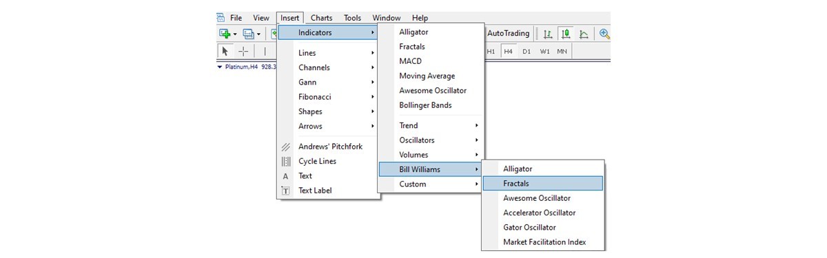
Bill Williams developed the Fractals indicator, in line with other well-known indicators, which is based on the notion of a fractal he introduced to the forex knowledge base. There may be various ways to apply it. Generally, it is used to identify stronger trend potential in the market and often market reversal points. Like any other indicator, there are advantages and disadvantages of it, and we will address all of that below so you may effectively use it in your daily activities.
Finding
There are two ways to find fractals on the chart.
The first one – manual. You will just have to read the following information and be able to identify each fractal on a chart according to the sequence of candlesticks required to form a fractal.
The second one is to click to reflect the Fractals Indicator on the chart. You will see the way to do that in the next image.
Composition
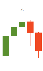
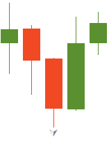
A fractal is a sequence of five complete candlesticks. It may be either bullish (down) or bearish (up).
You may see a small complication in the naming compared to the usual methodology: bullish normally means rising and bearish usually refers to falling in the forex world. While here, you see that a bullish fractal is also a down fractal and a bearish fractal is an up fractal. No need to worry, it is quite straightforward as you will see, let us have a look.
To separate a fractal from the continuous sequence of candlesticks on a chart, we have to find an arrow-like formation of five candlesticks (although it does not always have to be clearly resembling an arrow). Once we separated the five candlesticks, we look at the middle one (the third one, which is in the center). So now, we have a central candlestick with two wings: two candlesticks on the left and two on the right. According to the relative position of central candlesticks tip, we can identify our fractal as either up (bearish) or down (bullish).
In a bearish fractal, the central candlestick has the highest high, while those on the sides have lower highs. The fractal as a whole point up, but it precedes a downward movement. That’s the reason it is called bearish. See the image below.
In a bullish fractal, the central candlestick has the lowest low, with the higher lows on the left and on the right, like it is shown in the next image. As it often comes before the market reversal to the upward direction, it earned its name as a bullish fractal.
Now as we know how to find fractals on a chart, let us examine some practical applications for this tool.
Ways to use
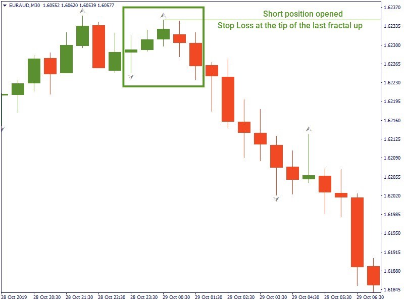
1. Fractals as a Stop loss. Another use of fractals may be the risk-management. In this case, a fractal serves as a stop loss level. An example below shows how opening a sell trade you may place your stop loss at the last up fractal (alternatively, if you buy, your stop loss will be at the level of the last down fractal). If you continue the marked line here to the left, you will see that it falls below the local resistance range (where the previous fractals up have their tips).
2. Fractal as a market reversal point. The most popular way to use this indicator is to use a fractal as a sign of market reversal is also among. The image below shows the price going down after a bearish fractal. It would be a good moment to sell for a trader. Conversely, as the market often goes up after a bullish fractal, it would be a good moment to buy on it if this is indicated.
Ways to combine
It is always better to have several indicators in use complementing each other rather than relying on just one. The Fractals indicator is not an exclusion. It may be as reliable or unreliable as any other tool, that’s why we will have a look at how you may combine it with other methods.
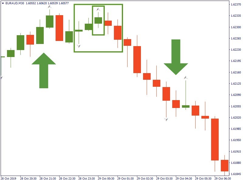
1. Fractals + trend analysis. The basic approach in forecasting the market movement is the trend analysis, we can include fractals into this logic. For example, we noticed that the market seems to be on a rise, we found a fractal as in the image below and it proves to be an up fractal. A bearish fractal following a rising market wave – that may be an indication for us that the market is going to continue the upward direction. So we would buy after the fractal is formed, keeping an eye on the trend expecting the further rise. The same logic would be applicable for a dropping market: we would sell on an expectation that the market would continue moving down, if you seeing a downward trend and finding a clear fractal up. To note: we use fractals here as an additional confirmation that we have understood the market intention correctly, rather than using the market trend to confirm our interpretation of a fractal.
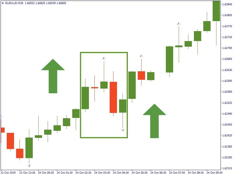
2. Fractals + Alligator. Bill Williams is famous for a series of other indicators he developed, Awesome Oscillator, Accelerator Oscillator and primarily Alligator. It would make sense to combine fractals with one or several of them, as they follow the same internal logic. However, we keep in mind that the trend observation keeps being cornerstone for our market prediction. For this reason, the first step here is just as it was in the previous example: we notice a rising wave of the market. After that we click to add the Fractals and Alligator indicators. On the image, you can see, that the price in the selected fractal is above the last fractal up and the red line of the Alligator at the same time – that would be a signal to buy. We sell, if the price is below the last fractal down and the red line of the Alligator. Thus, the approach here is to compare the price level to the previous up or down fractal in combination with the red line of the Alligator.
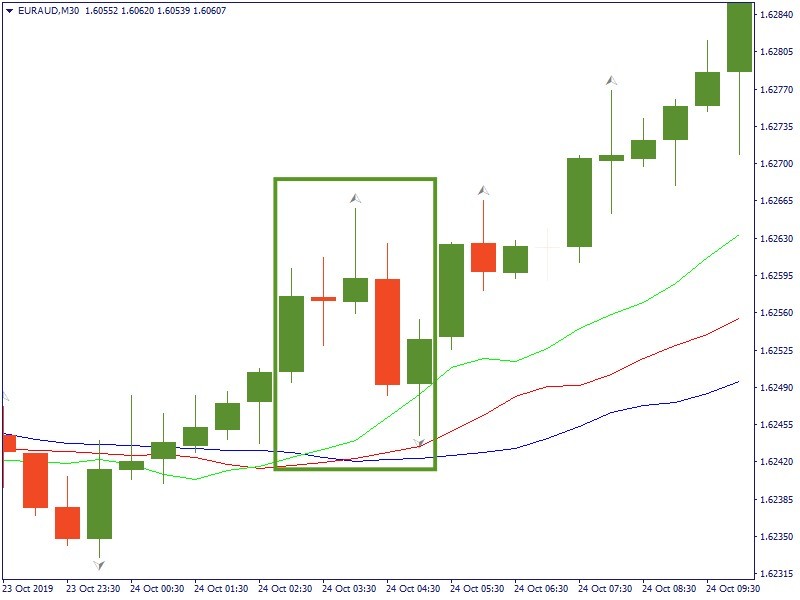
3. Fractals + Alligator (with Awesome Oscillator and Accelerator Oscillator). This example is essentially the same as the previous one but reaffirms it by further adding the Awesome Oscillator and Accelerator Oscillator into the logic. We have to look at the same fractal and we have to check it against the corresponding indication of the Awesome Oscillator and Accelerator Oscillator. The price here breaks above the last fractal up and it is above the red line. Also, the last two columns of the Awesome Oscillator and the last three columns of Accelerator Oscillator are green. This reassures us that the market intends to rise, so we buy.
Pay attention
There are several adjustments that a trader needs to make when using fractals.
Firstly, a Fractals indicator is a lagging indicator. Market may have been moved significantly, if before a fractal finishes its formation or is seen to be discarded. So, it’s important to get additional confirmation from other indicators.
Secondly, there may be a lot of fractals on the chart. This may create confusion. That is why you need to choose your trading strategy first or decide which fractal to trade on. Otherwise, may lead to losses, if you try the chase trades on each fractal.
And finally, fractals are more reliable when used on higher timeframes. However, there will be a smaller number of fractals formed on such a timeframe. Vice versa, on a lower timeframe there will be many single fractals formed but they have lower reliability.
Conclusion
Bill Williams Fractals is an interesting indicator with certain reasoning behind it and is among the basic ones which a lot of traders use it in their trading routine. It may be a very good element in the system of trading tools to identify possible market moves and make informed trade decisions. You will be the safe side of the market, if you use it carefully and trade with the trend.
Alexander Elder
Introduction
Beginner traders often look for a magic tool – a single indicator that would help them make big profits. They may get lucky for a while, but eventually, the magic disappears. When losses kick in, they tend to think that the reason for that is the unlucky indicator. So they go for another one, and the same thing happens.
Needless to say, it is a wrong approach based on the misunderstanding of the nature of the indicators. None of them is designed to make a flawless interpretation or prediction of the market. Moreover, none of them is designed to correlate with the other indicators. Rather, they are supposed to be used in combination, including the situations when they contradict each other.
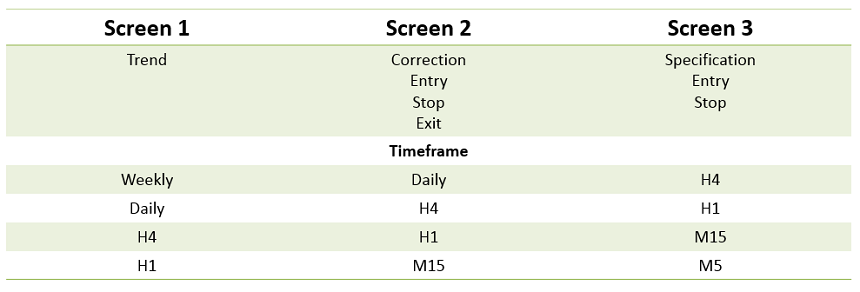
Alexander Elder is a well-known trader, famous for releasing several guidebooks on trading strategies. He invented a so-called “triple screen” approach. It combines various indicators and filters out their disadvantages while preserving their strengths. In a nutshell, it provides a three-tier approach to make a trade decision. Let’s have a look at it.
General
First, you decide which timeframe you want to trade on. Whichever it is, you will have two more timeframes to look at in relation to the chosen one: a higher one, which provides a greater context of the market, and a lower one, which provides a detailed view of the current situation and gives you a chance to choose a precise entry point.
For example, if you want to trade intraday, you may choose the H1 chart as the main observation field, the H4 to see the greater market context and the M15 timeframe for the entry point specifications. Each will be reflected in one of the three screens, as the table below shows.
The first screen
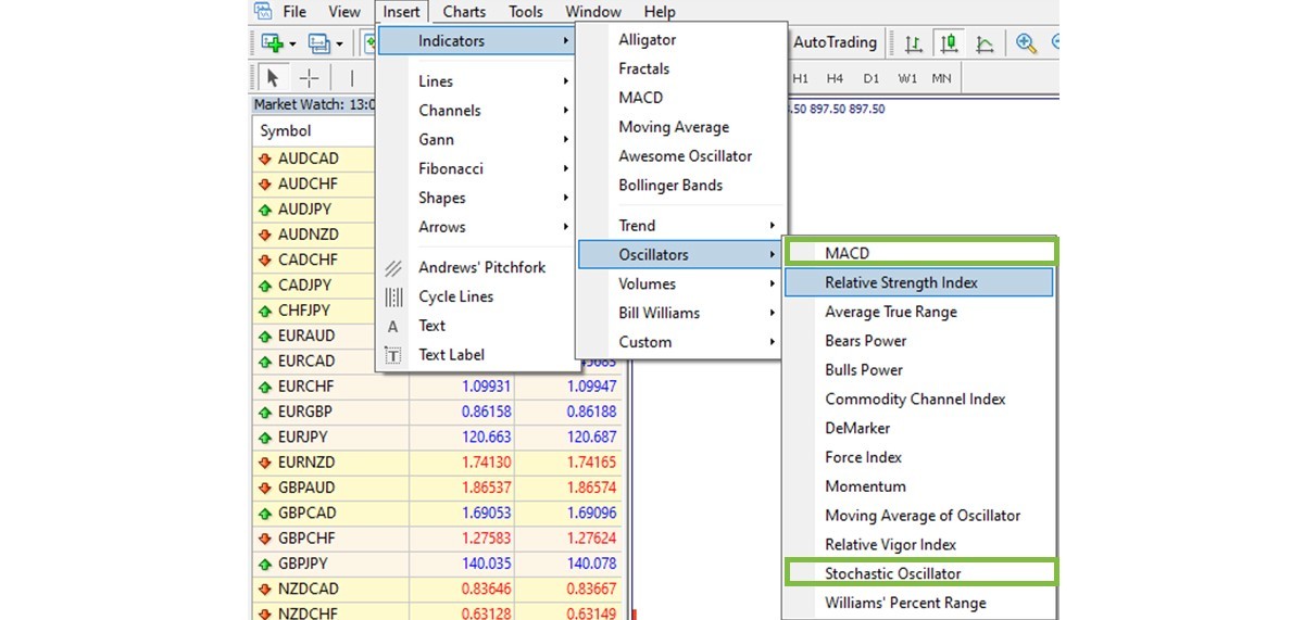
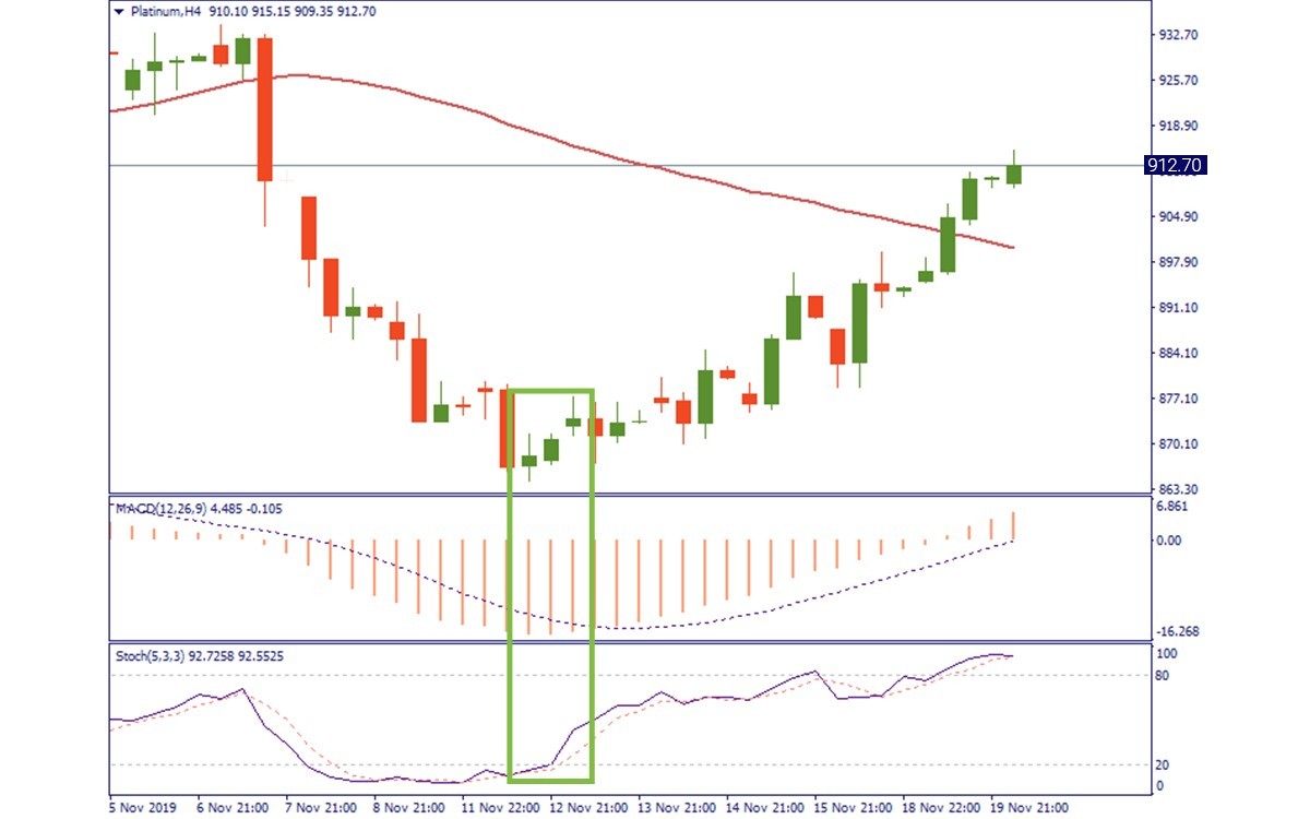
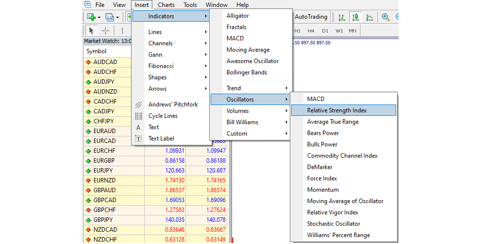
Let’s say we want to make some trades with Platinum. We open three charts: H4, H1, M15. We notice on the H4 chart of Platinum, that the price dropped and then entered a correction area. Based on this, we assume that it will go further up for a while within this correction course. Therefore, our idea will be to buy now and to sell when the price reaches higher levels. Now, we want to verify our observation and cross-check it against various indicators. For this purpose, we open the indicators menu and attach the MACD and the Stochastic Oscillator (the below image shows how to do that).
We see that the MACD has reached the extreme low below the signal line (the selected area on the below image). While the Stochastic Indicator shows the fast line (solid) crossing the slow line (punctured) bottom-up within the 0-20% zone. Both are normally interpreted as signs of the oversold state in the market and a signal to buy. Thus, we now have the confirmation from two indicators that our market interpretation is very likely correct and our strategy has a high chance of being successful. Now, we proceed to the second screen.
The second screen
The second screen serves to reconfirm the observation made on the first screen and to provide a more precise entry area. To do that, we add an RSI to the chart window. The below image shows how to select it.
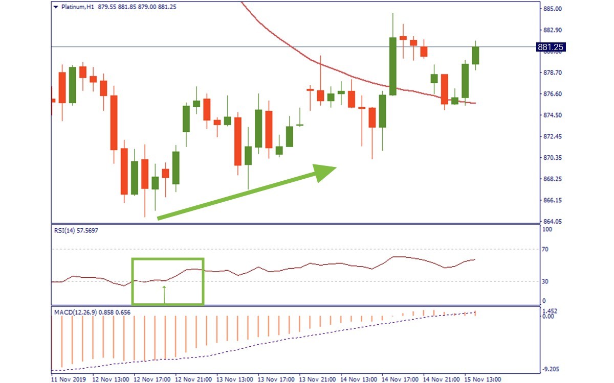
The RSI is a good tool, giving a fairly precise indication of the market strength and the moments where it is safe to open a position. As we are planning to buy on a correction rising trend, we will try to catch the moment to open a long position. Exactly that moment was shown, when the RSI crossing the 30%. On the H1 chart of Platinum, we see that it crossed the oversold level. Thus, we understand that the bullish push of the market is pretty strong. That gives us a second check with our trade strategy. Therefore, we proceed to the third screen to pick the level to open longs.
The third screen
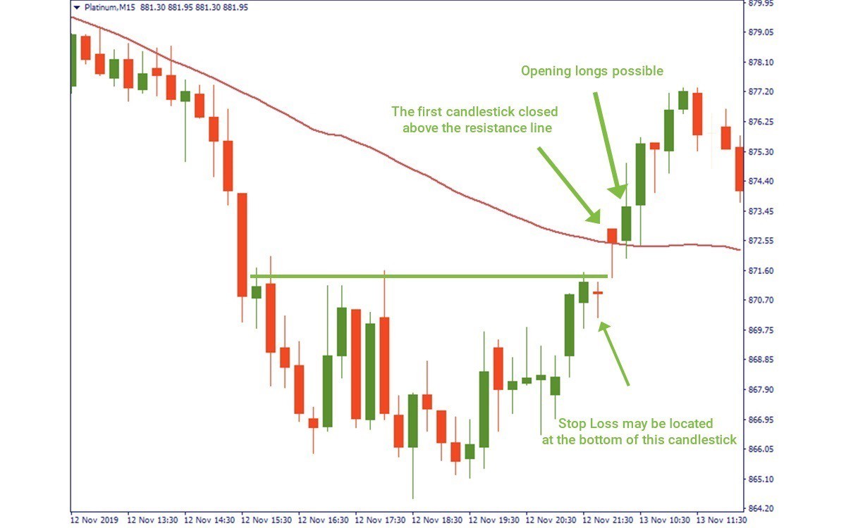
The third screen does not necessarily require any indicator. On the M15 chart of Platinum, we see in detail the wave that was indicated as an entry area on the previous chart. We just want to reconfirm now that there will be no sudden downward reversal, that would invalidate our market correction assumption. We wait for the price to rise above the indicated level along with the 50-period Moving Average. That is a signal for us to buy. We may open a long position right after the first candlestick closes above the resistance line, locating the stop loss at the bottom of the previous candlestick down.
Conclusion
The observed example provides a strategy for the local uptrend following a general downtrend. In other words, we tried to “ride the wave”: on the falling market, we buy at lows and sell at highs of each cascade. The vice versa scenario would work for the rising market.
Now, the traders may ask: what if the price acts differently compared to what we predicted. To this, we answer: there is no perfect trading methodology. Perfecting this approach is the duty of the trader, who wants to look for specific situations where it is applicable. you have to understand, in which exact scenarios this trading strategy is inapplicable. The idea of this strategy is simple: apply several filters to your decision making and use various indicators when making your trades.
Tony Plummer
THE SYSTEM STRUCTURE
The first task is to calculate two arithmetical moving averages namely, a 26-hour moving average of the hourly closing prices and the hourly equivalent of a 21-day moving average of such prices (that is,21 times the trading hours in a day). The shorter average highlights the short-term trend and the longer one relates to the longer-term, moreslow-moving, trend. Both averages are used to determine whether the current price is bullish or bearish within a particular time frame. A current price above a moving average will be bullish; a price below the moving average will be bearish.
Although it is unnecessary in a simple system such as this, the moving averages can be supplemented by an average directional
Indicator (ADX). The ADX gives an indication as to whether or not the market is actually trending. The second task is to calculate a momentum indicator that will give you both an indication of reversals in momentum and a tool to recognize non-confirmations. The most popular momentum indicator in modern markets is the moving average convergence/divergence (MACD) line, this indicator measures the difference between two moving averages. When plotted as a graph, the line oscillates slowly up and down as the two averages first diverge from each other, then converge on each other and finally cross over one another. The original version uses exponential moving averages, so that more weight can be given to recent time periods than to older ones. However, quite acceptable results can be obtained by using simple arithmetical averages. The recommended time periods for the two moving averages are 13-hour and 34-hour.When the MACD indicator is rising, the implications are positive for prices: if the indicator is less than zero (that is, the 13-hour average is still below the 34-hour average), then the market is only potentially bullish; if the indicator is greater than zero (that is, the 13-hour average is above the 34-hour average), then the market is actually bullish. The converse holds true if the MACD indicator is falling: if the indicator is above zero, then the market is potentially bearish; if the indicator is less than zero, then the market is actually bearish.
The third task is to calculate an indicator known as the signal line. This indicator is a moving average of the MACD line. Again, the best type of average for this purpose is an exponential average, but acceptable results can be obtained by using an ordinary arithmetical average. The recommended period for this average is eight hours.In principle, a definite recommendation to enter a trade is generated whenever the MACD line crosses the signal line.Once the mechanics for calculating these averages have been established, all that is necessary is to set out a basic set of entry and exit rules, then use them. These rules are obviously variable, but one particularly useful set of rules is given below.
THE ENTRY RULE
A position is opened when the MACD line breaks the signal line and one of the following supplementary (or confirming) signals occurs:
>>momentum has not confirmed the recent price low (in the case of a buy signal) or high (in the case of a sell signal);
>>the last price crosses the 26-hour moving average in the same direction as the momentum signal;
>>the last price signals a break-out from a valid price pattern;
>> the price is reversing away from a golden ratio objective.
THE EXIT RULES
Half of the trading position should be closed when the price hits a target calculated from golden ratio expansions or contractions, and if one of the following criteria is also met:
>> the golden ratio target is also at a support/resistance level;
>> momentum is diverging from the movement in absolute prices;
>>momentum is at an extreme and the ADX is not rising.
All (remaining) open positions should then be closed if either a pre-determined stop loss is triggered or if the MACD line breaks the signal line in the opposite direction to the trade.
OPENING POSITIONS
We shall now discuss the signals themselves in a little more detail. The entry rules essentially rely on a reversal in momentum (the MACD line) to establish the basic signal. However, it is still possible that the reversal will be too short-term to provide a profitable trading opportunity hence the use of supplementary or confirming signals.The first signal relies on the concept of non-confirmation. If the primary momentum signal is beinggiven on a reversal from a price extreme, and there has been a non-confirming divergence between the price extreme and the MACDline, then the signal has a greater chance of being valid.The second supplementary signal relies on the argument that themoving average approximates the trend in the market, and that a penetration of the moving average therefore indicates a change in trend.However, the signal has a greater chance of being valid if the moving average itself is in the process of reversingThe use of a moving average in this way is particularly useful when the primary momentum signal has been generated under very choppy trading conditions.The third signal allows for the break out from congestion areas, holding patterns, recognizable reversal patterns and trend lines. These patterns are the basis of much traditional technical analysis. In a sense, they are late signals because prices will already have moved some way before the signal is given. Nevertheless, such signals may constitute the last piece of information in the movement away from an area of very volatile price action.The fourth signal covers those cases where the price has reached avalid price objective and is reversing away from it. First, the price may have achieved a retracement objective of 38.2 per cent or 61.8per cent of the previous move, and may be moving back into the main trend. An MACD entry signal should catch such a renewed trend.
Indeed, it is particularly powerful for the 61.8 per cent retracement, where the market has re-tested the previous high or low. Second, the price may have reached a golden ratio objective for an impulse move and may be reversing into a new trend. The MACD entry signal should allow you to catch the beginnings of this new trend, too.
CLOSING POSITIONS
It is all very well entering trades successfully, but it is obviously also important to ensure that subsequent profits are not allowed to erode unnecessarily and that any losses are kept to an absolute minimum. To this end, the need to follow strict rules about closing positions cannot be emphasized enough.there are psychological influences that encourage traders to take profits too early and realize losses too late. There is also the related problem of identifying with trading positions so that self-esteem becomes dependent on the outcome of the trade. Both of these sets of problems can be reduced, or even eliminated, by adopting rigid exit criteria.
MONEY MANAGEMENT
Whichever approach is suitable for you, there are two cardinal money management rules that need to be obeyed5. The first is that no trade should allow you to lose more than 10 per cent of your capital. If you are trading equities, bonds or currencies, a stop loss should be triggered well before the 10 per cent limit is hit. Suitable adjustments should be made for leveraged futures positions. In options markets, no more than 10 per cent of your capital should beplaced on a single trade because there is a chance that the option may expire worthless. The 10 per cent rule should also be applied to recovery situations where the company has been facing severe financial difficulties, but is now considered to be over the worst.The second money management rule is that no more than 20 percent of your capital should be placed in a single investment. This will ensure that, if you are spreading your risk across markets or stocks,you should be able to hold at least five positions.If these rules are adhered to, then it will be possible to weather stormy times and still be able to take maximum advantage of prof- itable trading opportunities when they present themselves.
CLOSING AND REVERSING POSITIONS
If the current price is above the (hourly equivalent of the) 21-day moving average, then closing a short position automatically implies opening a long position. Thus, if the current price is below the 21-day moving average, then closing a long position implies opening a short position. Otherwise, the normal entry/exit rules apply.It is also worth emphasizing that reversals away from the goldenratio objectives can be used to anticipate this effect.
FINAL EXIT
Exit rules based on the golden ratio objectives will be very effective for a large number of or even on most occasions. However, once the market begins to reverse away from a target, then (whether or not any of the supportive conditions have been met) open positions should be closed when the MACD line cuts the signal line. No other factors need to be taken into account.
CLOSING OLD POSITIONS AND OPENING NEW ONES
There are two possible problems with these exit rules. First, if there has been some uncertainty over the level of the price pulse being traded, there may be occasions when positions are, in effect, closed prematurely. If the dealing rules are followed consistently, then this should not actually matter too much as a re-entry signal will inevitably be generated when the underlying trend re-asserts itself. Second, there are occasions when the short-term trading system
does not immediately show whether or not the closing of an old position should be accompanied by the opening of a new one in the opposite direction. In order to circumvent this uncertainty, it is a good idea to use a much longer moving average to define the background trend of the market. Without doubt, one of the best averages for this purpose is a simple arithmetical 21-day moving average. If hourly charts are being used, then it is a simple matter to convert the 21-day average into the corresponding hourly average. The market trend is then defined by the current price in relation to the moving average:
- if the price is above the average, and the average is rising, then the trend is bullish;
- if the price is below the average, and the average is falling, then the trend is bearish.
The rule for opening and closing positions is then quite simple:
- if the market trend is bullish, then closing shorts implies opening new longs;
- if the trend is bearish, then closing longs implies opening new shorts.
Considerations:
- Different analysts use different time periods for the calculation of the exponential moving averages. The original ones recommended by Gerald Appel were 12-period and 26-period averages respectively. Plummer’s researches suggest that 13-period and 34-period averages may give better results.
- Many analysts use nine-period averages.
- This particular trading system has been used by the author and is one that has been refined over a long period of time.
- These rules are for general guidance only. In modern, highly leveraged markets,great care needs to be taken with risk control. One of the best books on the subject is Elder, Dr Alexander (2002) Come Into My Trading Room, John Wiley, New York.
- The moving average signal is unlikely to be correct if it is generated when the moving average is still moving sharply against the direction indicated by the signal.
Example:
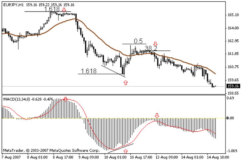
Here is an example of trading on the system with EUR / USD currency pair on a 1-hour chart. On August 8, a valid system sales signal was generated by the MACD indicator after the price reverses from 1.618 Fibonacci level at 165.20 (when the signal bar closes). The previous target wave was [164.15 – 162.25] * 1.618 = 165.30 (not visible in the graph). Subsequently, the price started to fall, giving grounds to keep the short position. On August 10, the price reached the level of 1,618 while the MACD indicator forms a bullish divergence. At this point, the short position closes, as a buy signal is immediately registered and returned. The short position gain is about 395 pips. The upward wave does not reach the level of 50% correction and goes to the side, after which a signal for sale is formed. The open long position does not generate high profits (about 25 pips). The price crosses the EMA26 downwards while registering a pillar breaking down the signal line in the MACD indicator. The last short position was found at 161.50 and by the end of the chart there is no reason to close as MACD draws deeper, negative pillars (current profit is around 230 pips).
Thomas Demark
The Demark Trading Strategy was developed by a guy called Thomas Demark.
The Demark Trading Method is based on drawing trendlines on recent swing highs or lows and as soon as these trendlines are broken, a position is opened.
This may not be 100% actually as the original demark trading strategy because you may find elsewhere but just a slight variation to keep trading this setup simple.
Timeframes: 15min upwards
Currency Pairs: Any
Forex Indicators: Nil
WITH THE DEMARK TRADING METHOD, DRAWING TRENDLINES IS ESSENTIAL
The Demark Trading Strategy mainly relies on you knowing how to draw trendlines properly. If you don’t know how to draw trendlines then here’s a brief lesson on drawing trendlines:
There are only two trendlines any trader can draw, an it can be either a falling trendline or a rising trendline.
To draw a rising trendline, you find two “bottoms” of price moves and connect them and you have a trendline like this:
To draw a falling trendline, you find two “peaks” of price moves and connect them and you have a trendline, like this:
RULES OF THE STRATEGY
The buying and selling rules of the demark trading method are really simple. All you need is a breakout of a trendline. Once that breakout is confirmed by the close of the “breakout candlestick” outside of the trendline that has been broken then you initiate a buy or sell order.
Here are the rules (refer to this chart below):
Step 1: Draw your up and down trend lines on your chart using the nearest lows for an upward trendline and using the recent peaks for your downward trendlines.
Step 2 : You have to wait for a break of the trend line on the chart to signal trend direction.
Step 3: At closing of the candlestick that breaks out, place an pending (buy stop or sell stop order) a few pips away from the high or low of the candlestick.
Step 4: For your take profit, use the previous swing highs or lows as your take profit target levels.
Step 5: Or you can use a trailing stop and place it behind the peaks and bottoms as a trade moves profitably to lock in your profit.
Larry Williams
Talking about trading systems, Larry Williams’ OOPS system still remains to be one of the most popular trading systems today. Larry presented his short term trading methodology in his famous book “How I Made One Million Dollars Trading Commodities”.
Today, a lot of different variations of this system are used worldwide by professional traders.
The OOPS pattern, as discussed by Larry Williams, is observed when:
The daily bar is opened below the previous day’s low.
Or when the daily bar is opened above the previous trading day’s high.
The theory behind this pattern is very simple and logical. Larry believes that non-professional traders check common charts at night and enter their orders for the upcoming day.
On the other hand, professional traders wait for the trend to be actually developed in the day and place their orders accordingly at the daytime.
Hence, if the market opens considerably lower or higher than yesterday’s range, it is an indication of the panic of non-professional traders. This provides a great opportunity to professional traders to use the non-professionals’ emotions against them by placing a contrarian trade and earn profits.
Basically, it is a gap trading strategy which means that it is based on fading the direction of the opening gap.
What happens is that non-professional traders usually overreact to some important news even before the market opens and create the gap when the market opens (especially in case of stocks, commodities or stock indices). This gap is the result of the opinion of the average crowd.
Soon, these traders notice that they overreacted in response to the initial event or news. At this point, the traders realize their mistake and reevaluate their position. This causes prices to reverse and a movement in the opposite direction occurs.
This trading system provides a lot of valuable information related to buying and selling in the FOREX market, even though gaps occur rarely since it’s a 24-hour market. However, weekend gaps at the open are quite common in the FOREX market, so the OOPS trading system will work best on daily and weekly charts.
The OOPS buy strategy is explained in the following points:
- There needs to be an existing downtrend on the chart for at least a few trading sessions. This will be usually indicated by several red candles on the daily or weekly chart.
- The market needs to gap down way below yesterday’s low during the last stage of the downtrend. This is signal for OOPS buy signal.
- The price starts rising and crosses yesterday’s low and yesterday’s close, as reevaluation by investors. This forms the buy signal and a long trade should be initiated here.
- The Stop-Loss is the low of the same day.
Similarly, the OOPS sell is generated according to the following pattern:
- Closely observe the chart and find if there is a prolonged uptrend for at least few trading sessions indicated by white or green candles.
- During the last stage of the uptrend, a gap higher should occur to beget the OOPS sell. It’s even better if the price opens much higher than the yesterday’s high.
- As reevaluation by investors progresses, the price starts falling and eventually crosses yesterday’s high and yesterday’s close. A short trade should be opened once this has occurred.
The Stop-Loss is the high of the same day.
The Larry Williams OOPS pattern has been used by numerous investors and traders and it is known to have a high level of accuracy and validity. It provides an opportunity to get valuable profits from fading the gaps.
However, it is still very important to remember that it is not a purely mechanical concept and it is possible for variations to occur in this system. Also a proper exit strategy should be defined as well.
Therefore, the best way to get started with the OOPS pattern is to use trial and error method. It is you who will have to figure out the best application of the OOPS system in different trading conditions and across different markets.
Disclaimer: The publications on this platform aim to provide useful information on financial topics. But they are NOT financial consultation or advice. Therefore they should not be used as a recommendation for making an investment decision on any type of financial products and services. We use in-depth research in the field but do not guarantee the completeness of the published materials. Always consult a specialist in your particular situation. "Applications In Life" Foundation is not responsible for any adverse consequences resulting from actions taken based on the information provided on the platform.